2015 Favorite Paint Color Trends {The New Neutrals}

Favorite Paint Colors: The New Neutrals
Hi Remodelaholics, it’s Cyndy from The Creativity Exchange back again to share my monthly paint color palette with you. By the way, Happy New Year!
Some of you may remember that last January, I shared a palette of my favorite colors from the 2014 color forecasts from the paint companies on Remodelaholic here.
This year, I’m doing the same thing as last year, but with a little twist. I have pulled together 20 of the most popular (and versatile) paint colors for 2015 and I have created two palettes; 1) The New Neutrals and 2) The New Transitionals. I’m sharing The New Neutrals palette on this Remodelaholic post today and at the very same time, I’m sharing The New Transitionals on my blog here.
**By the way, all of the images in this post are painted in colors from today’s palette. You can can find the paint color name and brand directly below each image.
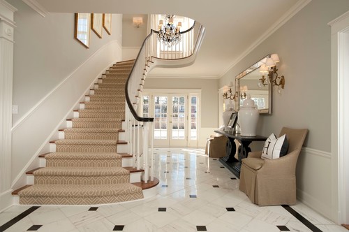
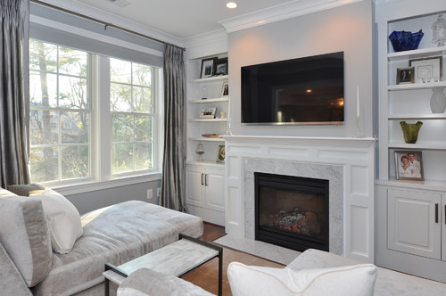
Repose Gray Sherwin Williams
Just a little background, for several years now, I have been picking my favorite paint colors for each year by looking at the forecasted colors, consumer trends and comparing to the paint companies best selling colors. Yes, I’m a paint color geek!
I then narrow the colors down by dependability and versatility. I only want to share colors with you that I know consistently work well in a variety of lighting situations and have an great track record with designers and builders. Of course, it’s still important to test a sample, but these colors are all excellent starting points!
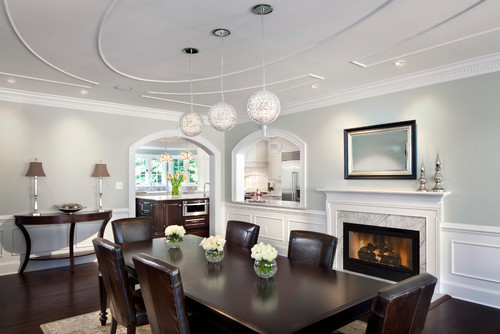
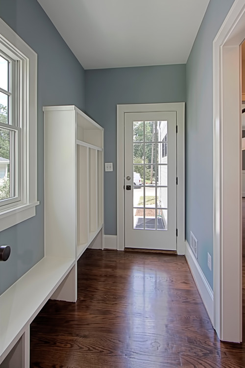
Quiet Moments (in flat) Benjamin Moore
For today’s post and palette, I thought it was time to update and pull together a palette of the new neutrals. Neutrals have really evolved over the last two years and now have more of an equal balance of warm and cool undertones. In the years past, neutrals tend to lean very warm with yellow based undertones. The new neutrals are really an almost perfect mix of warm gray balanced/offset with green undertones. So this undertone balance is fantastic because it will pretty much work with any color because finally, the neutrals are truly neutrals (unlike the past yellow leaning):
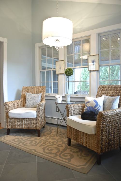
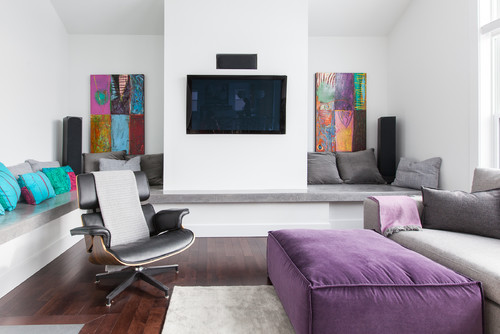
Balboa Mist Benjamin Moore
Also something very interesting with today’s neutrals is that colors that lean neutral blue or neutral green have become very popular staple colors used throughout a whole home and used as a neutral. Years ago, we would have never consider using a color like Quiet Moments (above picture) Smoke (Benjamin Moore) or Nimbus Gray (Benjamin Moore), throughout a whole home but these are three of the most popular paint colors today because people are looking for alternative to warm gray as an overall interior home color:
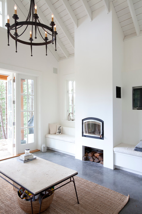
Smoke Benjamin Moore
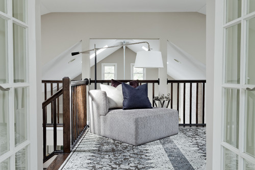
Nimbus Gray Benjamin Moore
Nimbus Gray Benjamin Moore
Whites are also very popular today and are also being used a lot as neutral and whole home colors. More than ever, people are painting their walls neutral white so they can mix and match bold colors and patterns:
Decorators White Benjamin Moore
If you want a more neutral white, colors like Decorators White Benjamin Moore or Simply White Benjamin Moore have very little undertone and are a very safe way to ensure that all the colors in a space will blend:
Simply White Benjamin Moore
Neutral Whites are especially important when choosing trim or cabinet colors. You never know a couple of years down the line what color walls you’ll want but if you choose a balanced neutral white like Eider White from Sherwin Williams, you will never have to worry about colors not blending:

Eider White Sherwin Williams
I am really loving the direction we are heading in paint color for 2015. Consumers still want calm and balanced wall colors because they are choosing to have fun with all of the great colors and patterns in fabrics and accessories.
I hope there is a color here today that peeks your interest! As always, please be sure and sample the color first just to make sure you’ll be happy with it in your space. Also, don’t forget that I have another 2015 favorite palette that I’m sharing today The New Transitionals over on my blog here, with more color possibilities and room inspiration.
If you haven’t had a chance to check out my Pick a Paint Color board on Pinterest here, it’s loaded with over 500 rooms and paint colors to help you envision a possible paint color.
Thanks so much for stopping by and Happy 2015 Remodelaholics!
Cyndy
——————————-
Looking for more great paint colors?
Paint Colors to Help Mix Warm and Cool Tones

How to Choose the Perfect White Paint

The Easy Way to Choose Paint Colors for your Whole Home


We built a new home last year and painted every room Eider White. I was so over making decisions (cabinets, tile, flooring, sinks, lighting………) that I just could not pick a color palette. Funny thing is the only room where it looks like the true color is in a bathroom without windows. Every other room it takes on the surrounding colors. So it actually doesn’t look like the whole house is one color!
Love this POST!!!! great colors! Thanks for sharing!!
Thanks for the helpful post! I have a question I am hoping you can help me with. I painted my bathroom vanity a light grey (with chalkpaint) and it definitely has a light blue look to it. The top of vanity (with seamless sinks) is off-white formica-ish. I am looking for a shade of white to paint the walls that won’t bring out the blue in the grey too much, won’t clash with the floors, and will just look clean. Do I look at whites with a certain undertone? The floors are saltillo tile (orangey) and the light, faucets, cabinet pulls are brushed nickel.
I have a “great room” area that has vaulted ceilings and lots of stairways (oak railing with white spindles). There is a lot of architectural angles (almost choppy). It was suggested to me by my painter that I paint the ceiling the same color as the walls. The back of the house has large almost floor to ceiling windows flanking a fireplace. I am looking into grays and greige colors for the great room. What do you think of painting the ceiling the same color as the walls? I know my painter would rather that because that way he wouldn’t have to cut around the ceiling/walls.
I’m looking to sell my home and want to paint neutral but pretty; however I have brown oak trim (ugh) so trying to pick a color to work with that. Carpet is light neutral beige.
Your home is beautiful, you are inspirational. Please come paint my house????????????????