Transitional Paint Color Palette

Today I’m back with another color palette of paint colors that can help when you want to transition your home or a room from warm tones to cool tones and vice versa.
Over the years, the number one paint question that I receive from my readers of my blog is how to transition a home from strong warm tones (yellows and golds) to the cooler tones (blues and grays). It can be overwhelming to choose just the right “transitional” color when there are thousands of blue and gray paint color choices out there. Knowing what a transitional color is and how to zone in and choose just the right color, can help you make a harmonious transition from warm to cool tones (or cool to warm tones) throughout your home.
A transitional paint color is one that has a stronger balance of warm and cool tones. A majority of the colors may have something like 90% of a warm undertone and 10% hint of of cool, the transitional color is going to be closer to 50/50 or 60/40. If the rooms in your home are all warm yellows and golden tans, you’ll want to avoid incorporating a strong cool gray or blue that has very little warm tones because there is not enough of a balance to help make for a smooth undertone transition.
Coventry Gray by Benjamin Moore is one of the best examples of showing you what a transitional color is because it has almost an equal balance of warm and cool undertones.
In this room below, you can see the warmth in the Coventry Gray on the wall. The warmer tones in the gray make it possible to mix together warm and cool tones in accessories, fabrics and fixtures:
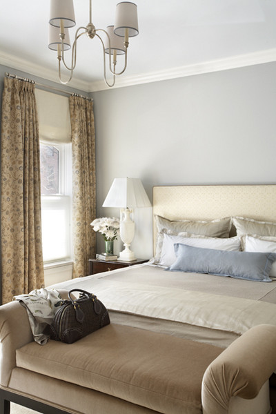
In this room below, notice again the mix of warm and cool accessories, fabrics and warm wood floors with the Coventry Gray on the wall. Transitional colors like Coventry Gray, help make it possible to mix warm yellows, golds and cool blues together to where they work beautifully:
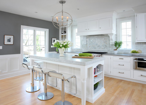
Imagine if you had a bright yellow room next to this kitchen below that is painted in another great transitional color- Chelsea Gray by Benjamin Moore. The bright yellow room would transition beautifully with this kitchen because the Chelsea Gray is a gray that has more percentage of warm undertones mixed with the cool gray. By the way, you can really see how this gray is an ideal transitional color because of the very strong yellow undertone in the wood floors:
Spotting transitional colors at the paint store is easy because transitional colors are the paint chips on the verge of moving into the next color. For instance, if your home is filled with warm yellows and you want to begin incorporating grays, look for gray paint chips right next to the green for warm gray transitional colors. Abalone by Benjamin Moore is another fantastic transitional color because it’s a light gray/tan that has just the right hint of cool. The blue pillows help us spot the slight hint of cool in the color:
Transitional colors do not have to have an equal balanced mix of warm and cool tones. For instance, if you have a strong warm tan color through your home and you want to incorporate a very slight hint of blue, colors like Rain from Sherwin Williams are a great way to do it. Rain is probably something like 65% warm and 35% cool and you can really see this undertone balance in the paint chip:

I hope this has answered any questions that you have about how to incorporate cooler or warmer colors throughout your home. If you are looking for more examples of transition paint colors, be sure and check out my “Pick a Paint Color” board on Pinterest here, where I have pinned more than 350 paint colors painted in rooms. If you’re looking for more help in determine how to get started in choosing colors, you can check out my tips here on my blog.
Have a great day!
Cyndy
———————————————————-
See more of Cyndy’s paint palettes
Browse our full Color Files to find the best paint colors for your home and decor


This is fascinating, Cyndy. I never considered where to find those transitional tones before. Thanks so much!
Very good tips.
Hi I can’t seem to find a paint color. I have bought like 13 samples and I’m just at a ylost. Maybe u can help me ??
Thanks
Rosanne
Hello Cindy,
I need to paint the my home and I like to go with gray in different undertone.
My living room will be imperial gray, and is open to see all other rooms.I need to color other rooms that go well each other. My family room has poor light and I like in cream/ gold tone, my library in tan color, my bedroom in different gray/blue color…. So help me out with a palette that look good with all those open room walls
Thank you
HI
Would escarpment from Benjamin Moore and Silver Fox from Benjamin Moore be transitional Colors? What Colors would go with these two?
Thanks
Cammy
Hi Cammy! Yes, these two colors that you mentioned are transitional. Well, maybe 60% warm and 40 cool. Because they are transitional, almost anything would work with them. White, off-white, black, gray, navy, indigo (especially), light blue with gray (or yellow) in base, light warm gray like Balboa Mist. I could really see these two colors in a palette of black, white with rich lighter indigo. Would be stunning combination. 🙂
Hi, I have a slate entry foyer can’t decided on a paint color
Slate is red, back & turquoise it’s the orginal floor & the house is 55 yrs old
Doesn’t get much light at all .right now the walls are white with light maple trim
Help!!! I’m struggling to find a gray color (or maybe different color all together) to go with promenade (Behr). This color is in a different room but you will see the other color from this room (open floor plan!) Any ideas??
Can you think of a medium or darker transitional turquoise or teal for an office? Thanks for the great article!