Coral Trellis Wallpaper Powder Room
Submitted by A Few of My Favorite Things
I want to thank everyone for all of the nice e-mails I’ve gotten wishing us happiness in our new home! It really means a lot. A few of you also asked to see some before and after pictures so over the next few weeks, I’ll share some of my favorite projects from the remodel. Let me make one thing clear from the get-go – we are so not do-it-yourselfers! There are a few things here and there that we took on but for the most part, we used contractors to make our vision become a reality. That being said, we did pick out all of the design elements ourselves so while we may not be handy, I like to think we have good taste ;).
Up first – the first floor powder room. When you walk in our front door, you’re greeted by a staircase and off to the left, our powder room. I knew that the door to the bathroom would always end up being open, so I really wanted to make the space to make a statement. When we bought the house, it said blah and boring.

It’s hard to tell from the picture, but the walls were a greenish beige I think would be best described as watered down pea soup. (I swear the previous owners of our house bought all of the paint on sale because the color palette was nauseating.)

The pedestal sink was fine (we actually ended up moving it into our guest bathroom) but didn’t offer any storage (notice the spare roll of toilet paper on top of the toilet) and the light fixture? Well, I’ll just leave it as not being my style.

From the moment I saw the powered room, I knew I wanted to wallpaper it, and I used this as my inspiration.
 |
| {via} |
You may remember I posted back in July asking for opinions on the patterns I was considering, and after a lot of debate, I finally went with this trellis design called Dolce Vita from the Grata collection by Antonia Vella for York (got all that?).

After choosing the paper, I struggled over which color to go with. The pink was too girly so I thought the best bet was either the navy or the kelly green, but after seeing the swatches, my husband voted for the coral.

I was shocked but happy – it was exactly the pop of color I was hoping for! And little did I know then that Pantone was going to name Tangerine Tango the color of 2012.

We were so ahead of the trend! So up went the coral paper and in went the new fixtures, and when you walk into our house now, here’s what you see.

I love love love it! The new sink has just enough storage in the drawer and the new light fixture is a lot more elegant. You may also notice that the floors are darker – we re-stained all of the wood floors in the house, which made a huge impact.

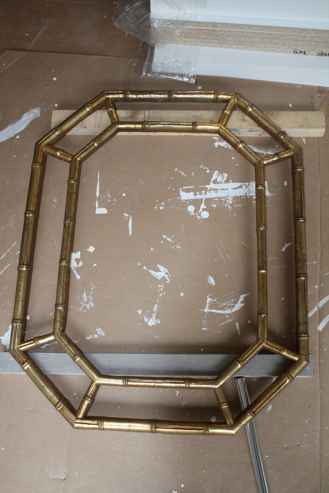
My one DIY project for the powder room was the navy lacquer bamboo mirror. I bought it at Goodwill for $30 and it originally looked like this.
After $12 worth of primer and spray paint….
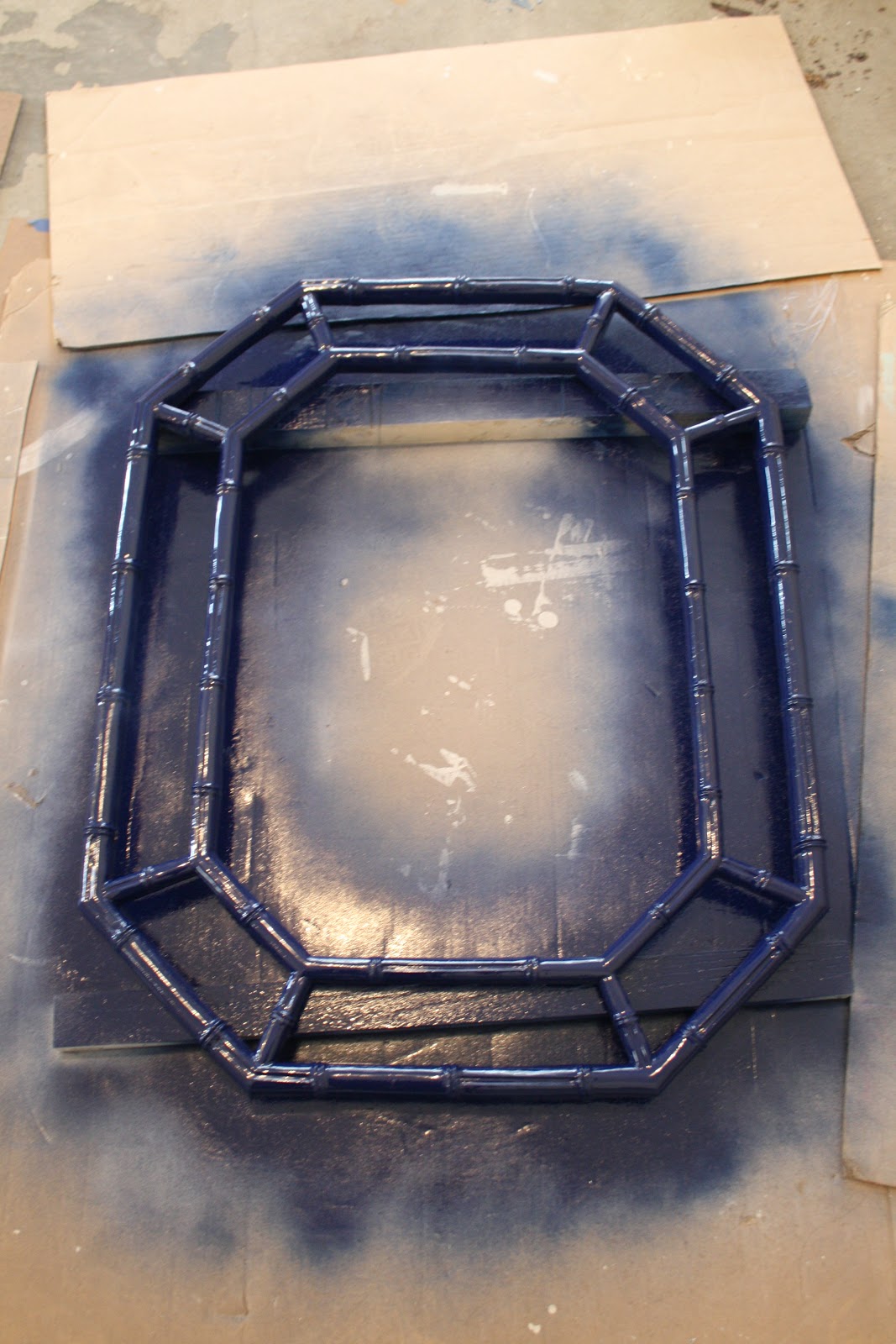
I think it’s perfect for the space. (Plus blue and orange are the colors of my alma mater. Go ‘Cuse!)


I LOVE what you did with this bathroom!!! I’m in the process of taking down 1980’s wallpaper in my bathroom – but oh my this is gorgeous!
So excited to see this here! Thanks so much for featuring our powder room remodel!
That is quite an impact! Nice job! I love the sink. I like how the toilet and sink are subtly rounded to match the wallpaper pattern.
I love your powder room. If you don’t mind me asking, where is your new vanity/sink from?
Samara
Oooohhh, I love everything about this transformation! The color, the pattern and that mirror. Pinning!
Gorgeous! That wallpaper is perfect for a small space – it makes such a great impact!
I’ve been reading your blog for a few years, and have been going back through old post to get ideas on a condo with builder grade finishes we just bought in Florida….Just saw this post…. So excited to see you are a Syracuse Alum!!
I love this wallpaper! Your bathroom is beautiful. I would like to use it in our new bathroom too. I am not able to find it available online. Where did you buy yours? Did you have to go through a local dealer?
Thanks!
Hi Kasey! This is a guest post so you’ll have to click over to the original author’s blog to check for certain if you can’t find it online. Sorry I’m not more help! Thanks for reading!
Interesting how things change in the style world. This is very retro, 1970’s. I had wallpaper very, very similar then and couldn’t wait to get rid of it when colors and styles changed in the 80’s. The best advice is to pick what speaks to you and go with it, just like this lady did. The only person you need to make happy is yourself. Off to my “nauseating Pea Green” kitchen, that I love, for a cup of coffee. Thanks for all the great ideas you share.
I agree! It doesn’t really matter how “stylish” it is — if it makes you happy, go for it! 🙂