First Annual Remodelaholic’s Favorite Paint Color Poll

For two years now, I have done an annual favorite paint color poll on my blog and it has become really a popular feature because we end up with a fantastic palette of paint colors that are tried and true, work in a variety of lighting situations and most importantly, colors that people love in their homes. Each year, our final palette has become a awesome resource for people looking for the best colors that don’t just look good on a card but look amazing on a wall!
**By the way, all of today’s images are colors from The Creativity Exchange’s favorite paint color poll here
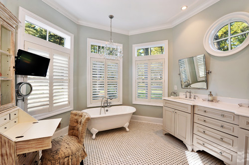
Sea Salt Sherwin Williams
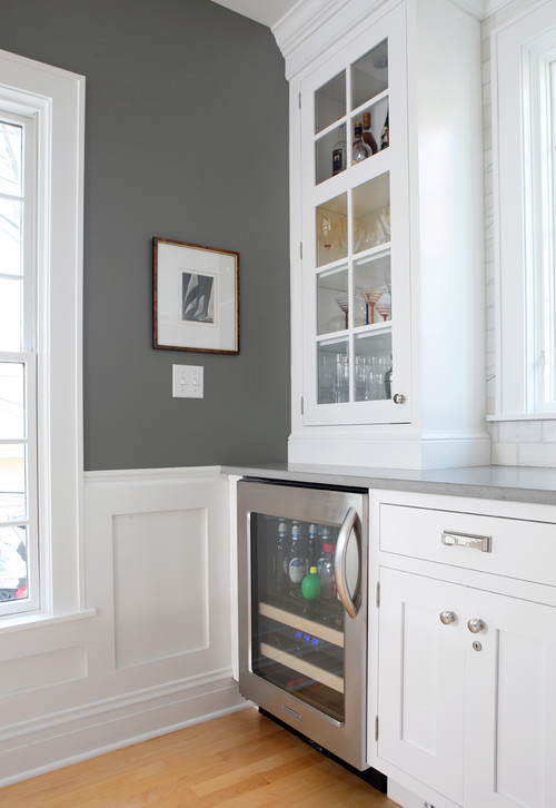
Chelsea Gray Benjamin Moore
For the next three weeks (starting today), we will be encouraging readers to vote by simply sharing your favorite paint color(s) here or via any Remodelaholic social media. All you have to do is tell us your favorite home paint color, or color that you have used in the past and loved and we’ll do the rest. You can share multiple colors and if you want to tell us why you love it, that’s great too!
Comfort Gray Sherwin Williams
On Friday, March 6th, we will close the voting and tally up the most popular colors and I’ll create a final palette of about 15 of the colors that were mentioned by reader’s the most. I will be back on March 13th, with the results and final palette.
Fieldstone Benjamin Moore
If you want to look through our final “favorite’s” palette from the poll we did on The Creativity Exchange, you can see our final palette here.
We can’t wait to start hearing your favorite “go-to” colors and pull together a final palette of Remodelaholic favorites!
Ok, I’ll start the voting off today by sharing my favorite paint color in my home, which is Repose Gray from Sherwin Williams. I love it because it looks amazing in any light and it’s a perfect light warm gray. I have it in several rooms in my home and it always looks so beautiful:

Repose Gray Sherwin Williams
Ok, now it’s your turn! I can’t wait to hear your favorites!
Cyndy


I LOVE Hague Blue by Farrow and Ball.
Walls- Wool skein -Sherwin Williams, Escape Gray- Sherwin Williams.
Trim- Benjamin Moore – White Dove
Thanks, Deanna!
Behr Haze – perfect neutral
Thanks, Stacy!
My favorites are all blues. Its so hard for me to step outside of my comfort zone.
Sometimes when your comfort zone is what makes you happy, that’s okay, too 🙂
We’re huge fans of BM’s Baja Dunes – although we lightened it 50% for some walls and then again 50% for others, and it’s just amazing.
Thanks, Lindsay!
BM Witching Hour for sure!
Thanks, Karisa!
It’s so hard to narrow them down but my favorites have been Perfect Greige an Peppercorn by SW
It is so hard to choose but two of my favorites are Perfect Greige and Peppercorn by SW.
Thanks, Emily!
My husband and I LOVE a color called Sandpiper by Martha Stewart – it’s a great biegey -gray that it perfect! It feels like being at the beach, looks amazing next to white trim and is a great bridge between grays and brown. We accidentally found it when we needed a “hurry up and paint we need to sell our house” color and loved it so much we’ve used it in almost every room at our new house.
-Amber @ http://www.AverieLane.com
How providential to find a color you love right when you need it! Thanks, Amber!
Cabbage Patch Green, by CIL. I LOVE it in my kitchen!
My living room is Dock Blue by Ralph Lauren. Love it!
Thanks, Nicole!
Filtered Shade by Valspar. A perfect taupe tinged grey that looks great no matter what the light in the room. I also love the lighter color on the card, Seashell Gray, which is a neutral barely-gray. I use it in my kitchen and rec room as an alternative to white.
Thanks, Trisha!
My current favorite is SilverMist by Sherwin-Williams.
Thanks, Dina!
I’m looking for a great gray for my home… can’t wait to hear everyone’s favorites!
I’m excited, too! Thanks Sarah!
SARAH, I just used Sherwin-Williams Special Gray. It looks so elegant!
Benjamin Moore Manchester Tan and Camouflage both work just about everywhere.
Thanks, Carol!
Macadamia Sherwin Williams
Swiss Coffee Valspar
Thanks, Meredith!
I think Surf Blue by Benjamin Moore is a new favorite — just painted some built-in shelves with it, and it’s so nice and bright without being overpowering.
Thanks for sharing your favorite!
Sherwinn Williams Watery!!
Thanks for sharing, Linda! Excited to see the finished palette 🙂
Right now my favourite colour is Pavilion Blue by Farrow & Ball, the shade I chose after an agonising hesitation for my kitchen walls. I must say that Hague Blue, mentionned above, is very, very interesting because it changes a lot depending on the light and time of day.
Thanks for sharing your favorite, Magali!
Beach sparkle by Valspar. I painted half my dining room (above the chair rail) that color something like 8 years ago and it still makes me happy every time I look at it. It’s probably too bright for most people, but it makes my heart sing.
Those are the best decor decisions to make — the ones that mark your heart sing! Thanks for sharing, Lori!