Choosing Paint Colors that Work with Wood Trim and Floors

My post today is really long overdue. In fact, today’s topic is probably the number one question that I have received over all my years working with paint colors. The question:
What are the best paint colors out there for wood trim and flooring?

Hi Remodelaholics! Cyndy here from The Creativity Exchange back with another paint color palette plus tips for choosing paint colors that go with wood floors, wood trim, wood cabinets, any wood feature in your home.
You’ll also like this post about how to use Sherwin Williams SnapIt for finding paint colors, plus my tips for choosing the best white paint color for your home and the best versatile black paint colors.

Choosing Paint Colors that Work With Wood Floors
I haven’t really delved much in the past into colors that work with wood tones for multiple reasons — but the primary reason is that it’s complicated.

It’s also a very subjective topic and if you asked another color expert, designer, architect, etc.., their opinion, you would get a completely different answer from each one of us.
Also, I have a very different approach/opinion than most people that takes some explaining.

Today, I didn’t want to just give you a list of paint colors that work best with wood trim/floors.
I also want to explain and make my case for why I recommend and completely avoid certain colors in these spaces.
If I can (hopefully) explain it well, it can help you down the line to know what to look for in a color and what colors you should be avoiding.
I have researched and pulled together a palette today of the most versatile and complimentary colors to use with wood floors/trims, etc.
These are about as safe as I can give you but again, it’s really important to test a sample color on poster board just to be sure it’s the color you’re looking for (plus the other tips here for making sure the paint color is right for your space.)
HOW TO TEST A PAINT COLOR
When you’ve chosen the perfect color (or several) — be sure to test it out before splurging for the gallon of paint!
- Get a sample tester or, even easier, a peel and stick paint sample swatch!
- Use an online paint color visualizer or paint color mobile app to test the paint color using a photo of your room.
- Follow our paint expert’s tips here for choosing and testing a paint color.
My chosen best paint colors that work with wood floors and trim
(Be sure to read the rest of the post for more information!)
- Benjamin Moore Decorator’s White
- Benjamin Moore Quiet Moments
- Benjamin Moore Vapor Trails
- Benjamin Moore Frostine
- Benjamin Moore Paper White
- Benjamin Moore Dewdrop
- Sherwin-Williams Rainwashed
- Benjamin Moore Gray Owl
- Sherwin-Williams Agreeable Gray
- Glidden Quiet Rain
I’m breaking down today’s post into three of the biggest problems that I see when it comes to paint colors for spaces with wood trim/floors and cabinetry.
How to Choose Paint Color That Work With Wood Trim and Flooring

Problem #1: Choosing Too Warm of a Paint Color
One of the biggest problems that I always see when it comes to paint colors used in spaces with wood trim and flooring is that people always tend to want to use some shade of yellow on the walls. If you search “wood trim and floors” on Houzz, 75% of the thousands of spaces you will see will be painted yellow or very warm tan.
The reason people gravitate to yellow/tan is they tend to want to choose a color that they feel will showcase all the warm beautiful wood tones in the space, so they choose the warmest color out there.
The truth is, painting these spaces in a warm color (especially yellow), has the complete opposite effect.
If you paint your walls yellow or in a warmer color, your wood trim and flooring will simply blend together because of the strong warmth in the wood and in the color. Plus, it’s way too much warmth.
Every room (in my opinion) should have a near perfect balance of warm and cool tones. It’s pleasing on the eye and our brain needs that color balance harmony.
Have you ever felt that something is bothering you in a space but you can’t put your finger on it? Chances are, it’s a lack of undertone balance and harmony.
Solution: Choose a Balanced Paint Color
The best thing a home owner can do to showcase the beautiful wood features is to choose a color that is 65-75% cool and 25-35% warm in the undertone.
This contrast is pleasing on the eye, the cool balances all that warmth from the wood and the very slight hint of warmth in the 25-35%, blends and connects the wood to the wall color.
The best place too find paint colors that are close to 65-75% cool are the colors right next to the shades of gray paint cards at the paint store. Colors that border the grays are better colors for complimenting wood tones.
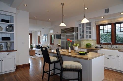
This wall color in the image below is about 85% cool in the undertone and just look how the wood floors and stairs just jump out and stand out:

This space below is more like 75% cool and 25% warm (ideal) and again, the beautiful wood floors and table are the star of the show:


Problem #2: Choosing the Wrong Shade of Paint Color
Another big problem that I see is that people do not think of their wood trim and flooring as a shade of color. I think people tend to think of wood as a neutral.
If you have dark wood floors and trim and you paint your walls a dark brown or a dark green, you have the same dark shade of color from floor to ceiling. Your wood color and shade blends in and there is no balance.
Even lighter pine is a shade of color and it’s not as light as many people think, but rather a mid-tone shade.
Solution: Differentiate Between The Wood Shade and the Paint Shade
Think of your wood trim and floors as a shade of color. My rule of thumb is to go at least three shades lighter in wall paint color (yes three).
This is the sweet spot where you will get both contrast and balance that will so beautifully compliment the wood tones.
If you only go up one shade, something will not look right because it’s too close to the shade of the wood.
Notice in the image below how the much lighter shade of wall color to the shade of the floors really showcases the flooring and the ceilings look taller:


Problem #3: Not Realizing that Wood is a Color
Lastly, another problem is that people do not realize that their wood features are in fact a color. Again, wood is not a neutral.
If you have pine trim and floors, then you have yellow in your space. Adding a color like light lavender to the walls will create a color conflict.
If you have cherry trim, floors or cabinets, that means that you have red in your space and a color like green on the wall may conflict.
This is something that you may not realize when walking into a space but something will feel “off” in the color combination if there is a conflicting color on the wall and wood tones.
Solution: Find a Paint Color Card that Matches the Wood Color
Go to the paint store and match a paint color card to your wood features in the space.
You will not get exact but get as close as you can to color and shade, and use it when choosing a paint color for the space. This will help to remind you of the need to think of your wood tones as a color and to identify the shade of your wood.

80% of the time, when recommending paint colors to people with both trim and flooring, I suggest white.
If people also have wood wainscoting, 100% of the time I will suggest white.
I know it’s not glamorous and it may “sound” boring but in my opinion, nothing showcases, calms and balances strong wood features and undertones better than white.
White also instantly neutralizes strong warm wood tones and it allows for almost any color to be safely used in the space in accents, fabrics and art.

(Wood floor stain is Quartered and Rift cut White Oak with Minwax 1/2 Special Walnut, 1/2 Jacobean)
Another trick is to only choose from the top two lightest colors on a paint card. Again, it’s important to work in the cool undertones but if you stay around the lightest shades of colors, that will also help.

If you have more questions and want to see more of my color palettes and advice, you can find all of that on my blog The Creativity Exchange. I would love for you to stop by!
Also, if you’re looking for more versatile and dependable paint colors, my top 15 colors can be found here.
Thanks for stopping by today!
Cyndy
——————————————
More great paint picks from Cyndy:
click each photo to see more details


Please pin for later!


Appreciate the effort you took to create this post, absolutely awesome!
xoxo
https://confusedgirlinthecity.com/blog
Thank you so much Giovanna! I sure hope it helps. 🙂 Cyndy
Our pine wood ceilings are a golden colour, I am not sure of the cooling colours in this palette, they may clash. They are good choices for dark or cooler wood tones.
Hi Cristina! This palette will work for all wood tones. However, if you have pine, you have that golden color. So you would need to sample a color from the palette that would compliment golden. For wood ceilings (especially pine), I suggest keeping the walls very light to white. Paper white, Decorator’s White or Frostine from the palette would be great colors to look at.
I love this article so much!! We are trying to remodel a 20+ year old bathroom. A light gray vanity with marble top, wood looking porcelain tile on the floor and subway tile master shower. Problem is PINE EVERYWHERE. We have pine trim and doors. I love the idea of the whites suggested above. Do you think that’s our best bet despite already having so much white/gray in the bathroom? Was thinking a light gray wall. Everything looks blue!! HELP!
I also have this same scheme going. I’m contemplating whether or not just to paint the bathroom trim white or if there’s a paint color that I could use instead on the walls.
Your woods in these photos are rich and lovely. Just want to send another hint out there for those that have the “meh” woods or honey oak (let’s be honest, pretty darn blah). I recently used SW7641 Collonade Gray and it’s really lovely. The room had lots of natural light, which always helps too.
Thanks for this post! We are currently in the process of purchasing our 1875 victorian that we have been renting for a couple of years, so I’ve started gearing up to start making it our own. The biggest issue is that the original pine floors and all of the gorgeous moldings are unpainted, but a really horrible orangey hue. We want to keep the historic charm of the unpainted wood, but deciding on a color to repaint (it’s a greige right now) has been really bringing me up short. Thanks so much for the help!
Could you recommend a color that would complement Ikea Bodbyn gray kitchen cabinets? We are remodeling our kitchen. There will be white subway tile on the oven wall, grey distressed wood floors and we have dark wood trim/doors. I am feeling overwhelmed! Your blog is very helpful. After reading it, I was wondering if I should lean towards BM atrium white or Chantilly lace, but the Ikea gray is throwing me off. Thank you!!!
Great post! Very helpful. We have medium dark to dark wood ceilings, medium (no red) wood cabinets, and faux wood plank grey/beige tiles in kitchen and entryway (medium oak hardwoods everywhere else). We currently have BM Dunmore Cream on the walls, and it’s driving me crazy. To your point, it is just overly warm. And does nothing for the floors. I’m leaning toward BM Morning Dew. While that one isn’t on your list, it seems close to several on the list. Do you think I would be happy with that? I can’t make another mistake without risking my husband strangling me lol. Thank you!
Although I found your comments interesting I have to say they aren’t 100% true. In my home which we’ve been completely remodeling for a year now we have added tons of wood. Framed out the picture windows, added hardwood floors, wood kitchen cabinets. All in coordinating colors. To find a color that would play well we wanted something light so not to distract, cheery to brighten up Washington rainy seasons and that our art will pop well off of. After tons of samples and trips to the paint store I landed on Lemon Ice a very pale yellow, your never use choice. Everyone has commented on what a beautiful color it is. Not just friends and family but also the painters, plumber, electrician and kitchen cabinet installers all made comments on how much they like the color choice.
Made not always be the right choice but sometimes it can work beautifully. Never thought I would choose a yellow. Not the biggest fan of using it for a paint color. But this color I absolutely love.
Thank you for suggesting yellow !!! I am really considering a pale yellow for my open concept home. It is neutral and happy !!! Would luv to see pictures.
Wow, I could have written this. I, too, live in Washington state and painted my condo with BM’s Lemon Ice several years ago because I wanted something light and airy and, yes, cheerful. Living here makes me gravitate toward yellow. Must be the lack of sun. Anyway, for the most part it is a lovely color, nearly white but not quite and very cool. I have mostly warm, medium woods with black appliances and lots of white (trim, doors, blinds) some gray-blue and cheery greens. Lemon Ice can be quite sharp, however, and sometimes I wish I’d gone one shade lower on the palette and maybe a shade or two less cool. I’m looking for a change now and will probably stick with another light, nearly white color.
What color would you recommend for a log home interior color. Too much warm pine tones and floors are overwhelming.
What wall color recommendation do you have to compliment cool white wood floors? In blues and/or gray. Thanks!!
We recently moved into a four square home built in 1916. It has gorgeous wood trim in a walnut stain, and inlaid hardwoods with the walnut color as the inlay and an orangey stain for the majority. The previous owner had every room painted before she put it on the market, but I HATE every color she chose (of course). The blah builder beige on the main floor walls is bringing the whole space down rather than making the woodwork pop, and everything looks so sad.
I crave light and bright, and most images we see these days are light and bright, but I was trying not to jump on the white bandwagon because I feared it would be too stark with the dark wood. However, after reading your post and a few others and looking at lots of photos, a milky white might work fine. Although I’m really leaning toward a barely there blush — mostly white, with blush pink undertones. We shall see!
Could you recommend some cream colors that go with brazilian cherry floors.thanks
Hi Shana! Simply White from Sherwin Williams is a beautiful color to look at that would work. Also, I love Eider White from Sherwin Williams. It’s a little warmer with a slight gray undertone that would also compliment cherry wood. I hope that helps!
As a first time home owner, I really appreciate this post! I’m in a bit of a pickle though. My floors are a lighter golden shade of wood, but the rooms have much darker wooden trim. It’s part of the reason I fell in love with this 1913 home, but it’s making me tear my hair out when it comes to design! Any advice you can give would be so appreciated!
Hi,
I am looking for advise on a gray color for a new cabin great room.
I have pine trim in medium color / pine tongue and groove ceiling / Wood flooring in a two toned color from Lowes / and a large corner stoned boulder fireplace with lots of gray and beiges in it. I was looking to add a gray paint color for some contrast but don’t know if that looks good with the wood tones in the room.
Any advise. I looked at a couple gray tones and the pink /lavender does not work at all. I looked at a jogging path color from SW but don’t know if a green undertone would work or not. Any other suggestions with maybe just a little less green undertone.
Thanks so Much
Hi! Great tips. I am researching to come up with a wood stain for my floors. Have cinnamon wood trim. IT is sort of a rich dark reddish brow I guess. . Old house with high ceilings, lots of trim, built in bookcase. Wanted to keep that color so just freshened it up. Very high ceilings in living room, so ceiling a darker shade that complements the walls to make it feel less cavernous. . Walls are the palest blue with a touch of lavender I guess. So, my problem is what do I stain the floors, don’t want to go as dark as the trim. So far, I love how it is turning out but am having problems coming up with stain color for the floor. I have all hardwood oak floors. Thank you for any suggestions.
This post was fantastic, so informative! I had numerous a-ha moments. Thank you !
I have a bedroom with dark blue carpeting and cherry woodwork. I would help picking a gray paint that will look nice in this room. Any suggestions. My painter is using sherwinn Williams paints.
Thank you, this post was so helpful, especially the sample paint cards!!
Hi. We are building a Log Home and need help on selecting kitchen cabinets color/stain and also help on a color scheme throughout the home. Our floors will be Hickory and all the walls inside are tongue and groove white pine. I am thinking of the blue family such as navy with burgundy and cream. I’m not very good at selecting colors and need help. Thank you for any suggestions. Ellen
I am trying to paint a house that has original 1930’s medium to dark hardwood floors, trim, mantel and staircase. I see a lot of white trim and painted trim/accent surfaces. I am trying to preserve the original wood features of this older home due to excellent condition of the material as well as brighten up the room. Any suggestions with regard to colour palette to look into?
We have cherrywood cabinets and flooring. My husband does not like cherrywood or any flooring or cabinets with a red hue. I’m looking for a wall color to offset the red tones. Any color suggestions? Would a light gray color work well? What about Sherwin Williams “Agreeable Gray”?