Spring Styling – Brightening up an outdoor space for spring.

I rounded up some inspirational porchy spaces to get us all in the right frame of mind.


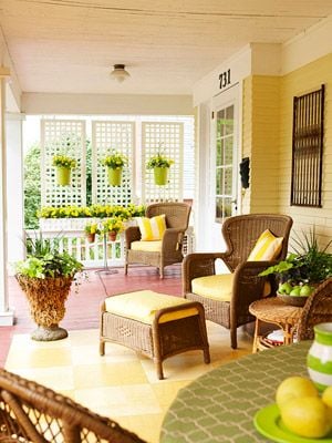
Doesn’t all that eye candy make you want to get outside and decorate a porch? It put me in the perfect frame of mind to create a sunny space of my own. Here’s what I came up with:
For your convenience, this post contains affiliate links, which allow us to continue providing you lots of decorating and DIY ideas at no cost to you. Learn more here.

See sources and similar products for this mood board here.

I love warm colors in outdoor spaces. Last year, I put together a patio-themed mood board using bright pinks and oranges. This time, I focused on sunny yellow. I love modern design and I always feel like, especially in outdoor decor, a lot of things I see out there tend toward a more traditional, farmhouse-craft-chic look (is that a thing??). Don’t get me wrong, it can be beautiful and very inviting, but for my mood board, I wanted to mix things up a bit, so I stuck with a more minimal aesthetic.
To get the modern outdoor look I was after, I followed a few basic rules:
• Clean Lines and Shapes: To keep the space feeling modern, I carefully chose items that have really clean and simplified silhouettes. Viewed separately, some of them may not scream ‘modern design’ but the overall aesthetic is absent of ornate curves, rustic distressing, or frilly accents that can detract from a modern decor scheme, and that’s why it works. I worked in a few very modern pieces (like the planters and the chairs) with a few more traditional or vintage feeling pieces (like the bird sign and the planter stand) to create a space that feels modern, but not cold.
• Simplified Patterns: Maybe the most important thing to keep in mind if you’re aiming for a simplistic modern design style, is to avoid wild patterns. While I love pattern, and it definitely can work in a modern space if used in moderation, the types of patterns that lend themselves best to this style of design are geometric (as in the rugs) rather than organic. While I did throw in one patterned pillow to keep things from feeling too rigid, floral patterns or patterns with too much movement can quickly transform a space from feeling clean and modern to feeling a bit more eclectic and collected.
• Brights and Neutrals: For this space, I chose one really bright color to tie everything together and give it a wow-factor, but worked to keep everything else pretty neutral. Blacks, grays, whites, and natural brown tones provide a perfect base for the yellow to pop off of, and keep the look clean and minimal.
• Depth through Texture: Despite not having a lot of frill, this space actually has quite a bit going on in terms of texture. Mixing materials like wood, metal, fabric, plastic, cement, ceramic, and fiber rugs, not to mention adding in greenery, creates a really rich feeling space with a ton of textural elements.
Overall, I’m really happy with how this moodboard shaped up. I kind of want to use it to style my own outdoor spaces this spring, and despite the rain outside my window at the moment, I think the mood has gotten much sunnier in here!
Happy Spring, friends! As always, thank you to the Remodelaholic team for having me back each month. If you like what you see, be sure to visit me over on my blog, DesigningDawn, or follow along on social media. See you again next month!
-Dawn
See more from Dawn:
 |
 |
 |
———————————————–


